Add blocks three different ways by:
- Type / to choose a block
- Select “add block” + icon
- Select “toggle block inserter” + icon
(As shown by using a List Block)
Media Blocks
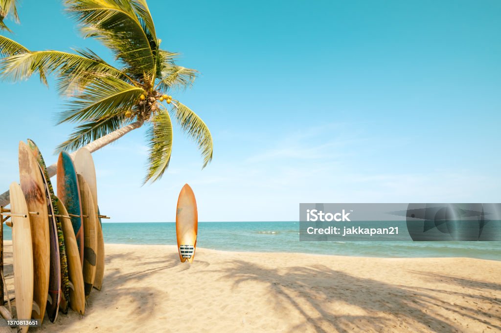
Image Block:

Add images!
Image Gallery Block:


Video Block:
Add embedded URLs or upload video files, like Mizzou’s fight song!
Cover Block:

Similar to Image Blocks, but features a different size and has the option to add blocks inside…
…Like another image!
(Don’t you wish you were there)
Add as many blocks as you want!
Media and Text Blocks:
Rain storm passes Jesse Hall during sunset
Oct. 24, 2021. Sam O’Keefe/University of Missouri
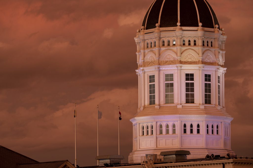
Add text or blocks next to an image, like descriptions and photo credits
Text Blocks
Text Blocks are best used together, such as adding quote blocks inside paragraph blocks to add emphasis to the quote. This is a paragraph block, which allows text to be written and formatted. This includes bold, italics, hyperlinks, strikethrough, subscript, superscript, and inline code! Text Block’s typography size can be changed as well, with medium being the default. It can be changed between small, medium, and large text size, and effects the entire block.
“Quote Blocks are best used in between Paragraph Blocks “
-The Creator of this Page, using Large Text Size (for dramatic effect)
(Using a Quote Block)
Quote blocks have the option to edit heading size, text size, and appearance. For the quote block used above, the heading is H2, text size is level 1, and the appearance is set to bold.
Pull Quote Blocks
for extra dramatic effect
Like Quote Blocks, Pull Quote Block’s heading size, text size, and appearance can be altered. What makes using Pull Quotes unique is the ability to add borders and altering border thickness and radius.
HEADING BLOCK!
Heading Block’s default setting is H2, but can be changed between H1-H6, whichever is preferred. The one used directly above is H4, while the “Text Blocks” heading is H1.
Reasons to use a List Block:
- Break up lengthy paragraphs to highlight important text
- Numbers can be used to list steps
- Listing things is fun!
Choose between bullets or numbers for your lists, along with the level ranging between 1-6
Table Blocks:
| Label 1 | Label 2 | Label 3 |
|---|---|---|
| Tables | are | a |
| fun | way | to show information! |
Design Blocks
There are four Design Blocks that are used to format and space blocks evenly. Group and Column Blocks are block containers (such as the ones mentioned above) and Separator and Spacer Blocks… separate and space blocks.
- Group Block
- Groups blocks together inside one container. There are three layout options, a group, row(horizontal), and stack(vertical) and each can hold multiple bocks.
- Note: The blocks used on this page are all stacked on top of each other, and this helps keep blocks organized and under the same parent block.
- Columns Blocks
- Allows you to insert text, media and other types of content into up to six columns.
- Note: Variations of column splits include 100, 50/50, 33/66, 66/33, 33/33/33, 25/50/25, or skip and create from scratch.
- Separator Block
- Separate two blocks of content by a line.
- Note: Separator blocks have been used to separate sections on this page
- Spacer Block
- Allows you to add more space between two blocks.
- Note: A spacer block is used between this text and the button blocks
Button Blocks:
Prompt users to take action using button-style links, for example a WordPress Basics page.